Here’s a punk rock opinion that will shock you to your foundations: writing is hard. Especially so when it comes to product design, since first you have to understand precisely how something works and then you have to succinctly explain to the user why you’re telling them about this complicated thing and then you have to carefully explain what they need to do next. Ugh! That’s hard!
But when it comes to writing, the tone is equally difficult to get right and I’d say that lately it feels as if every app and website sounds the same: they’re all uncomfortably happy to see me…
“BORN TO INSPIRE”

“START A BOLD NEW WORLD TODAY”

“CONGRATULATIONS! YOU DID [VERY BORING THING]!”
Every website, to my ear, sounds as if it’s written by the same maniacally happy person sat at their keyboard typing. But I get why. Companies want to sound alert, inspiring, delighted to meet your acquaintance yet because this writing style is now so common, it has the same effect as using the popular, boring ol’ typefaces over and over again: something special is lost in the repetitiveness of it all. Just open up any app on your phone and it’s guaranteed to be too bland to remember, the writing equivalent of when every website was using Helvetica or Georgia. Everything is a little too pleasant, a little too nice that I personally find kinda creepy.
Does all writing have to be this way though? Are there other ways to write for a product or a website or an app?
Well, at Sentry I think we sometimes nail that fine line between clear copy and tone. Here’s an example: a while ago I was designing a modal and I knew that customers would be bummed out about seeing yet another one of these. But we had to explain to customers that a new feature was available and so I thought, what if we made this modal like a little character with a mood? What if we made this modal in on the joke? It’s simple and also incredibly dumb, but here’s what I came up with:
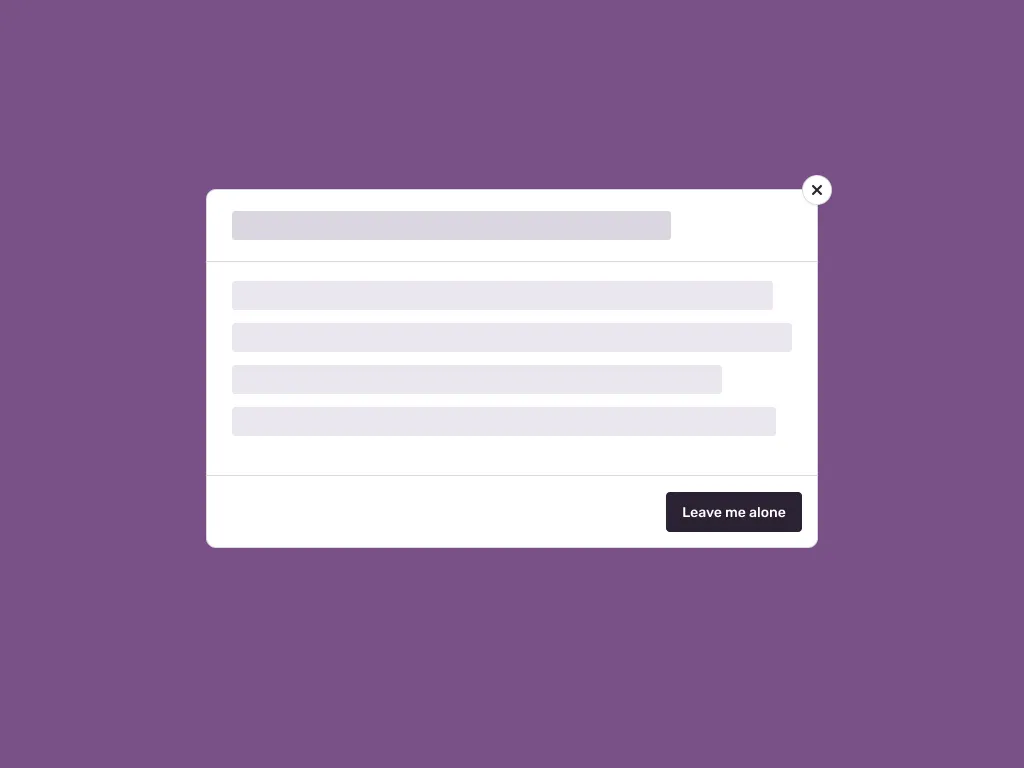
How many Save and Confirm buttons have you clicked over the years? A hundred thousand? A million? But how many Leave me alone buttons have you clicked? Precisely! It’s just quirky enough to be both silly and memorable.
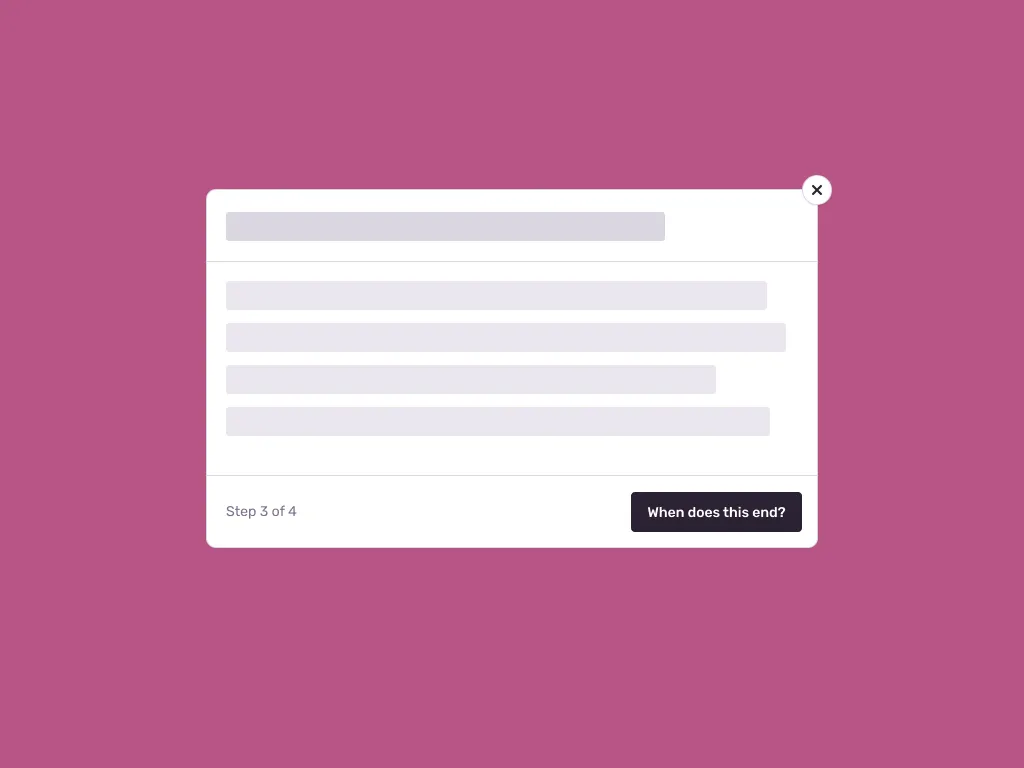
Oh and that reminds me of this multi-step tutorial we made some time ago:
I want interfaces to treat us like people, not overly-positive automatons that have to hear songs and watch confetti rain from the sky at every step of a checkout flow. Sometimes it’s okay to be a bit rude and weird for fun.
Of course—yes yes yes—this all depends on context. If there’s an urgent task or a problem affecting a user then that’s not the right time to tell them to “Get a life” or “Go away.” A website for a hospital should never give me a wedgie and make fun of my glasses because that’s not fun, that’s just plain mean. But the more I write copy for interfaces the more I realize that these products we’re working on can try a bit harder even during the boring moments in the downtime, the moments when things are painfully bland.
Our words should aspire to be so much more: more fun, more interesting, more jovial. And so we don’t need big new paradigms or fancy CSS libraries to make our interfaces great, all we need sometimes is a text editor, some time, and a good dictionary close by instead.
(But being a jerk helps, too.)