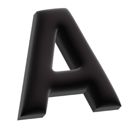
We all know the drill. Hack Week. Experiment. Try stuff. You get it. I love the promise of a Hack Week: a time-boxed challenge to create something useful without overthinking it. This time, because I sit on the design team, I decided I wanted to try and make a typeface. I knew I wanted at least a full alphabet to write things with, so my initial goal was simple—design a bold, all-caps header font that could pair well with our brand type, Rubik. Boom, Hack Week. Let’s go.
Finding the Right Inspiration
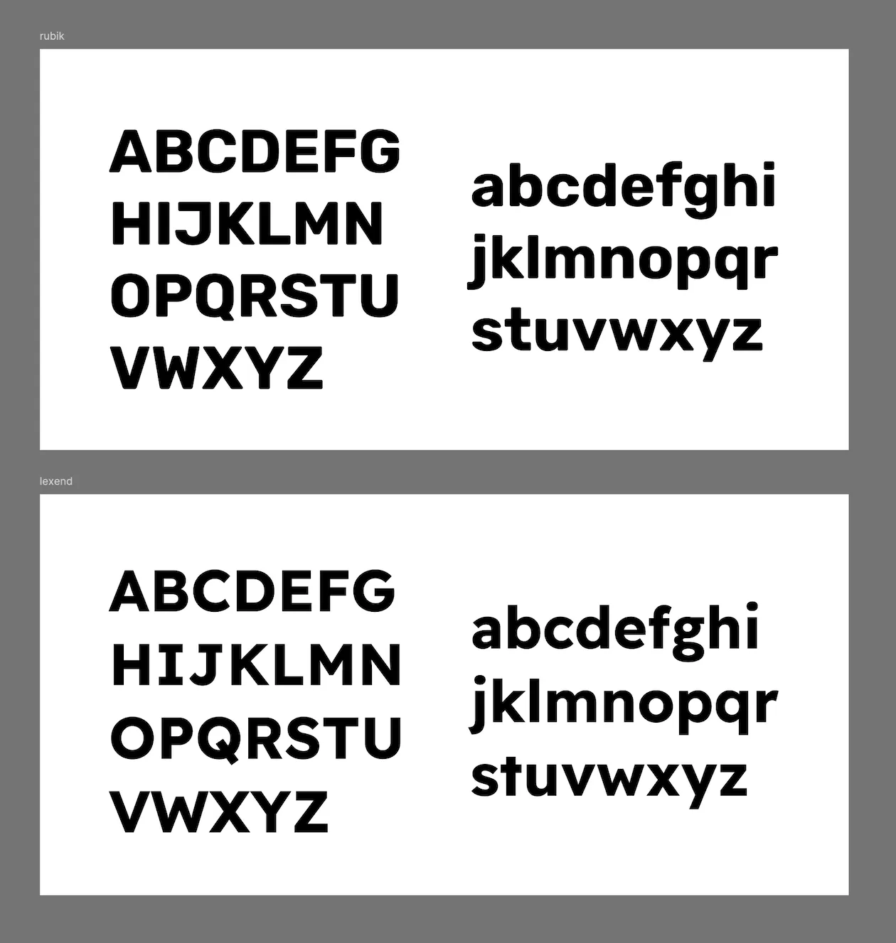
Before this, the closest I had come to creating a full typeface was a pixel font I made a few years back, which had been guided by a very strict limitation: pixels. So in a search for some direction with the possibilities of bezier curves, I spent a while looking through a lot of great sans-serif typefaces. Obviously, there was Rubik, which is slightly square-ish and has rounded corners. But I wanted to mash our reliable brand type up with something else. I looked for something readable but with an underlying personality. I wanted something with a helpful confidence. The voice of someone who could show you the way and not be pretentious about it.
One that really stood out for me here was Lexend. It was extremely readable even at small sizes and had a certain charm. It was sharp but ultimately just wanted to help you understand, and that felt right. I also personally loved the barred capital “I”.
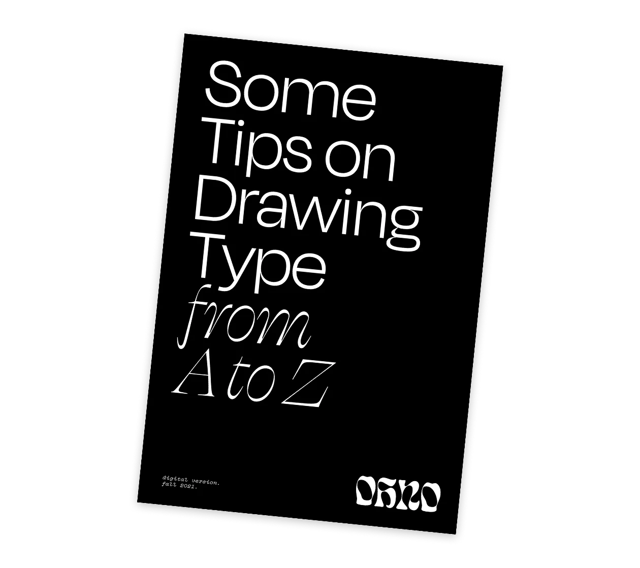
Probably the most important piece of inspiration and guidance came as a short zine, Some Tips on Drawing Type, by James Edmonson at Oh no Type Co. This short book was focused enough for me to remember the tips for each letter and feel confident that I was avoiding big-no-no mistakes while keeping up my momentum. I didn’t stop to doubt myself (too often) because I felt I at least had the core of what I needed right. At least right enough to impress a few coworkers (hopefully).
From Hack Week to a Usable Font
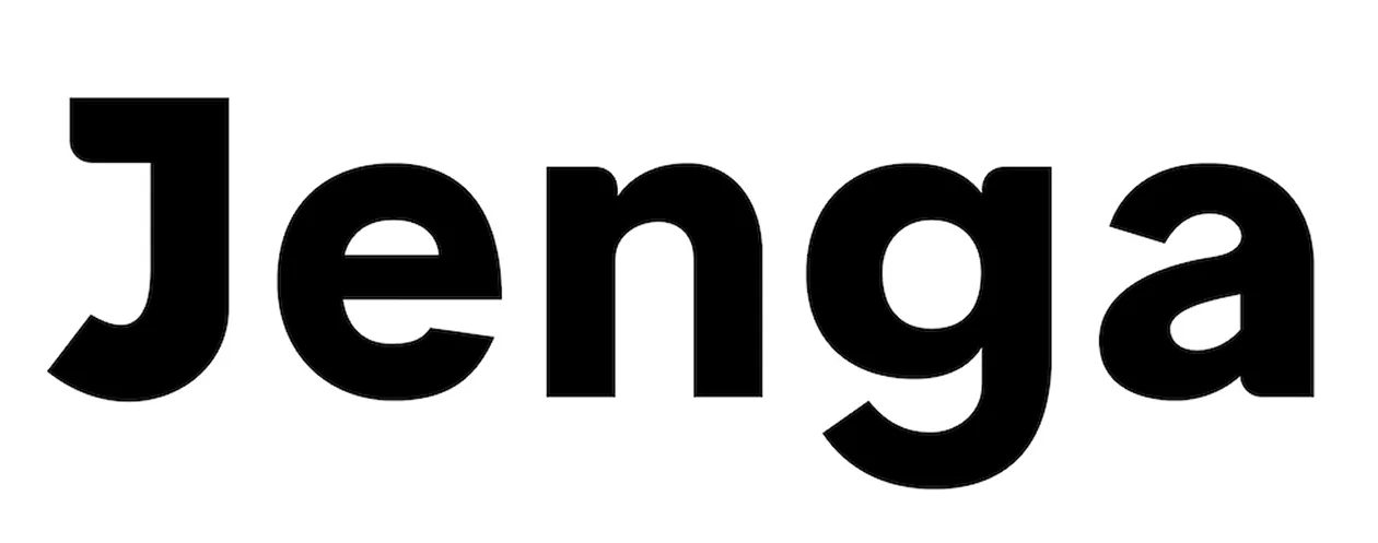
Once I got going, I was surprised how much I was able to get done in these few days. The time crunch really did its magic and forced me to keep zooming out and moving rather than obsess over one letter. By the end of Hack Week, I had a full set of uppercase and lowercase letters, along with some basic punctuation. It was pretty thrilling to be able to start typing full sentences with letters I had drawn. For a while the font was simply known as “Hack Week Sans” but by the end of the week, I had given it a proper name; Dammit Sans.
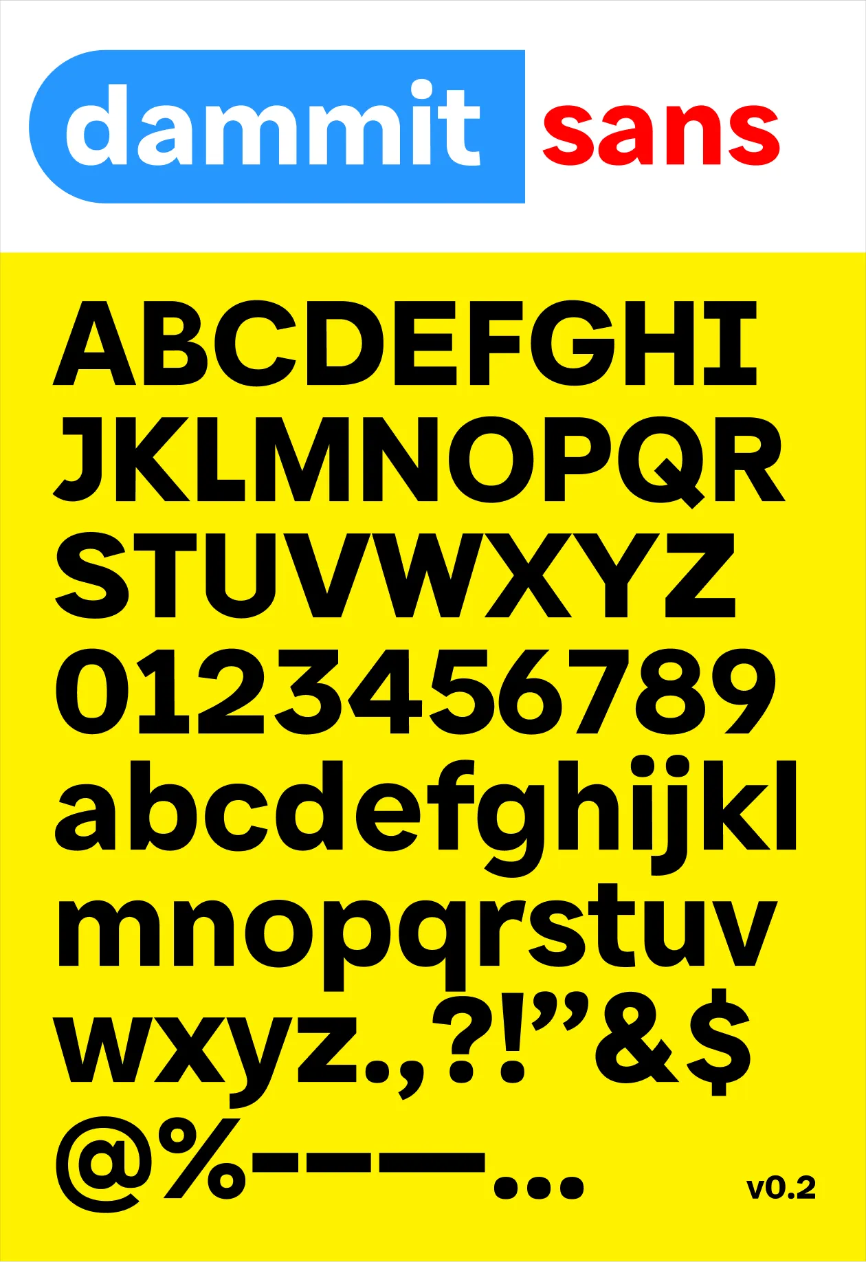
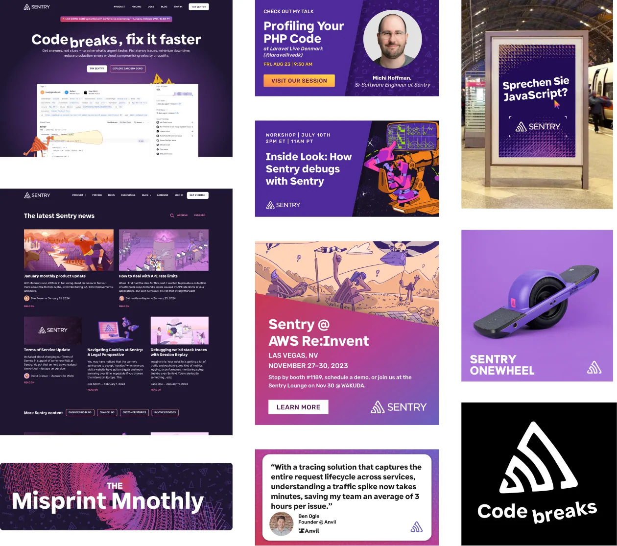
I will admit, I did spend some time trying to give the letters rounded corners on some of the notches. I was hoping to give Dammit Sans something extra unique yet still subtle, something tied to the rounded corners of Rubik, but ultimately it just felt distracting and like it was trying too hard. Slowly, one by one, I let them go. I even left just the one, final rounded corner on the capital “Q” for a while before finally removing them completely.
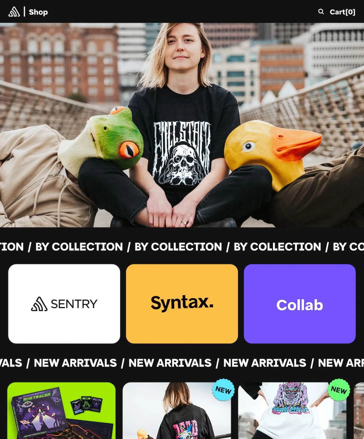
After Hack Week, I purchased the full version of the font software I was using (Glyphs), continued to refine letters (big thank you to the Speed Punk plugin), and expanded the character set, making it somewhat more useful. Today (Feb 2025), we use Dammit Sans as a display font on our merch store site.
What’s Next?
Maybe one day we’ll expand it—add weights, italics, and more refinements. Maybe next Hack Week. But for now, Dammit Sans is out in the world, doing exactly what it was designed to do: being the font we convinced leadership to let us ship.